Vela Ul

Prompt para IA (HTML, React, Tailwind & Shaders)
Build a single, fully self-contained `index.html` — one file, no build step, no external
requests of any kind (no CDN, no webfonts, no images, no video, no data: URIs). All visuals
must be pure CSS gradients plus inline SVG. Inline all CSS in one <style> in <head> and the
one script in a <script> at the end of <body>.
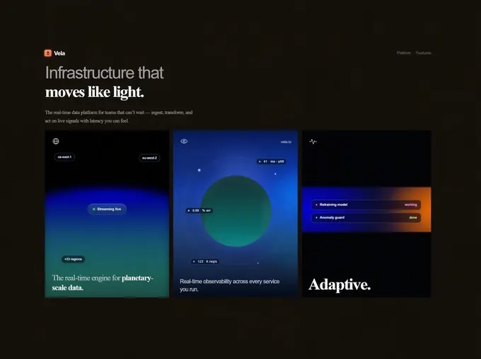
It is a dark, cinematic hero page for a fictional real-time data platform called "Vela",
built as a FIXED 1690×950 design canvas. The canvas is uniformly scaled to FIT the viewport
at 700px and wider — the composition is preserved verbatim, never re-flowed — and only below
700px does it reflow into a single stacked column.
=== DOCUMENT HEAD ===
<!doctype html>, <html lang="en">
<meta charset="utf-8">
<meta name="viewport" content="width=device-width, initial-scale=1, viewport-fit=cover">
<meta name="theme-color" content="#16120c">
<title>Vela — Infrastructure that moves like light</title>
=== ROOT TOKENS ===
:root {
--canvas-scale: 1;
--ink: #f7f5f2;
--muted: #aaa7aa;
--panel: #16120c;
--line: rgba(184, 198, 229, .22);
color-scheme: dark;
}
* { box-sizing: border-box; }
html, body { width: 100%; min-height: 100%; margin: 0; }
html { -webkit-text-size-adjust: 100%; text-size-adjust: 100%; }
body {
overflow: hidden;
background: #16120c;
color: var(--ink);
font-family: Arial, Helvetica, sans-serif;
-webkit-font-smoothing: antialiased;
text-rendering: geometricPrecision;
}
=== CANVAS + SHELL ===
.reference-canvas — position fixed; left 50%; top 50%; width 1690px; height 950px;
overflow hidden; transform: translate(-50%,-50%) scale(var(--canvas-scale));
transform-origin 50% 50%; isolation isolate; background #16120c.
.shell — position absolute; z-index 5; left 0; top 0; 1690×950; overflow hidden;
border-radius 0; background var(--panel); box-shadow none.
=== MARKUP STRUCTURE ===
<body>
<div class="reference-canvas">
<main class="shell" aria-labelledby="page-title">
<header class="nav">
<div class="brand" aria-label="Vela home">
<span class="brand-mark" aria-hidden="true"></span><span>Vela</span>
</div>
<nav class="nav-links" aria-label="Primary navigation">
<span>Platform</span><span aria-hidden="true">·</span><span>Features</span>
</nav>
</header>
<section class="intro">
<h1 id="page-title">
<span class="headline-sans">Infrastructure that</span>
<span class="headline-serif">moves like light.</span>
</h1>
<p>The real-time data platform for teams that can’t wait — ingest, transform, and<br class="desktop-break"> act on live signals with latency you can feel.</p>
</section>
<section class="cards" aria-label="Platform features">
… three <article class="card …" tabindex="0"> …
</section>
</main>
</div>
Use the typographic apostrophe ’ in "can’t" and a real em dash — in the paragraph.
=== NAV ===
.nav — absolute; left 168px; right 177px; top 37px; height 28px; flex; align-items center;
justify-content space-between.
.brand — inline-flex; align-items center; gap 9px; color #f9f7f4; 20px/24px; weight 700;
letter-spacing -.45px.
.brand-mark — 24×24; flex 0 0 auto; border-radius 6px; position relative;
background: linear-gradient(145deg, #ff9a71 0%, #ff724c 68%, #e95235 100%);
box-shadow: 0 0 13px rgba(255,112,69,.48), inset 0 1px 0 rgba(255,255,255,.32);
::before and ::after both: content ""; absolute; left 50%; transform translateX(-50%);
border-left 4px solid transparent; border-right 4px solid transparent.
::before { top 5px; border-bottom: 6px solid #17130e; }
::after { bottom 5px; border-top: 6px solid #17130e; }
(This carves two dark triangles out of the orange square — the Vela mark.)
.nav-links — flex; gap 6px; align-items center; color #5d5a5b; 13px/18px; weight 700;
letter-spacing -.15px.
=== INTRO ===
.intro — absolute; left 169px; top 89px; width 620px.
h1 — margin 0; letter-spacing -2.8px; font-weight 300.
.headline-sans — block; color #aaa6a8; 60px/66px; weight 300 (inherits the Arial stack).
.headline-serif — block; color #fffefd; font-family "Times New Roman", Times, serif;
58px/64px; weight 700; letter-spacing -3.15px.
.intro p — width 585px; margin 25px 0 0; color #a29f9e; Times New Roman serif stack;
18px/30px; weight 400; letter-spacing -.52px.
=== CARD GRID ===
.cards — absolute; left 169px; top 322px; display grid;
grid-template-columns: 440px 439px 441px; gap 12px; width 1344px; height 586px;
overflow hidden.
.card — position relative; height 650px (intentionally taller than the 586px grid so the
bottoms are clipped); min-width 0; overflow hidden; contain paint;
border 1px solid rgba(12,18,32,.5); border-top-color rgba(25,35,65,.14);
background #020204.
.card:focus-visible — outline 1px solid rgba(175,198,255,.52); outline-offset -2px.
.card-left, .card-middle, .card-right also get: background-origin border-box;
background-clip border-box; background-repeat no-repeat; background-size 100% 100%.
=== SHARED CHROME ===
.card-icon — absolute; z-index 6; left 25px; top 25px; 25×25; color rgba(255,255,255,.90);
filter drop-shadow(0 0 5px rgba(255,255,255,.1)).
.glass-pill — absolute; z-index 7; inline-flex; center/center; gap 8px; min-height 22px;
padding 0 9px; border 1px solid rgba(137,158,210,.30); border-radius 999px; color #c2cbe6;
background rgba(7,16,39,.68);
box-shadow: inset 0 1px 0 rgba(255,255,255,.08), 0 4px 13px rgba(0,0,0,.20),
0 0 14px rgba(45,97,255,.10);
backdrop-filter: blur(13px) saturate(150%) (with -webkit- prefix);
white-space nowrap; 12px/20px; weight 600; letter-spacing -.18px.
.dot — 5×5; flex 0 0 auto; border-radius 50%; background #7adcc0;
box-shadow 0 0 3px rgba(122,220,192,.5).
.error .dot — background #d4e8ff; box-shadow 0 0 4px rgba(200,220,255,.5).
.dot.yellow — #ffd462; box-shadow 0 0 5px #ffd462, 0 0 13px rgba(255,197,68,.82).
.dot.violet — #c69ff7; box-shadow 0 0 3px rgba(190,150,240,.4).
.card-title — absolute; z-index 7; margin 0; Times New Roman serif stack; color #c7cfcc;
weight 400; letter-spacing -.95px.
=== CARD 1 — .card-left (aria-label "Planetary-scale streaming") ===
Children in order: <div class="left-surface" aria-hidden="true"></div>, the globe SVG,
four glass pills, the h2 title.
.card-left { background: #000; } .card-left::before { content: none; }
.left-surface — absolute; z-index 0; inset -1px; overflow hidden; background #000;
transform scaleY(1); transform-origin 50% 100%;
transition: transform 720ms cubic-bezier(.22,1,.36,1), filter 720ms cubic-bezier(.22,1,.36,1);
will-change transform, filter.
.left-surface::before — content ""; absolute; left -2.5%; top 32%; width 105%; height 84%;
border-radius: 50% 50% 0 0 / 7% 7% 0 0; /* the planet-limb curve */
background:
radial-gradient(ellipse 58% 16% at 50% 0%,
rgba(16,0,224,.84) 0%, rgba(8,0,181,.58) 43%, rgba(2,0,118,.18) 72%, transparent 100%),
linear-gradient(180deg, #0700a4 0%, #06019f 5%, #06148f 12%, #0a3385 20%, #13517a 30%,
#19646d 42%, #1c6762 53%, #1d5a53 64%, #1d4842 74%, #1a332e 83%, #111d17 93%, #0e140e 100%);
filter: blur(14px);
box-shadow: 0 -9px 24px rgba(0,0,156,.34), inset 0 8px 22px rgba(9,0,178,.22);
Hover/focus: .card-left:hover .left-surface, .card-left:focus-visible .left-surface {
transform: scaleY(1.075);
filter: saturate(1.34) brightness(1.08) contrast(1.04);
}
Globe SVG (viewBox "0 0 32 32", fill none):
<circle cx="16" cy="16" r="12" stroke="currentColor" stroke-width="2.25"/>
<path d="M4 16h24M16 4c4 4.1 5.8 8.2 5.8 12S20 23.9 16 28c-4-4.1-5.8-8.2-5.8-12S12 8.1 16 4Z"
stroke="currentColor" stroke-width="2.05"/>
Pills:
<span class="glass-pill region-left">us-east-1</span>
<span class="glass-pill region-right">eu-west-2</span>
<span class="glass-pill live"><i class="dot"></i><span class="live-copy">Streaming live</span></span>
<span class="glass-pill regions">+28 regions</span>
Shared override for .region-left, .region-right, .regions:
min-height 28px; padding 0 11px; color #d6dced; border-color rgba(125,145,202,.32);
background rgba(4,10,28,.57);
box-shadow inset 0 1px 0 rgba(255,255,255,.055), 0 4px 12px rgba(0,0,0,.17);
backdrop-filter blur(8px) saturate(125%); 11px/26px; weight 600; letter-spacing -.1px.
.region-left { left: 32px; top: 79px; }
.region-right { right: 32px; top: 82px; }
.regions { left: 56px; top: 438px; }
.live — left 150.333px; top 256.333px; width 137px; height 39px; min-height 0; padding 0;
gap 8px; color rgba(211,232,248,.88); border 1px solid transparent; border-radius 20px;
background:
linear-gradient(180deg, rgba(29,62,138,.90) 0%, rgba(23,53,123,.91) 46%,
rgba(14,42,99,.92) 100%) padding-box,
linear-gradient(180deg, rgba(135,155,244,.55) 0%, rgba(104,135,212,.48) 55%,
rgba(86,123,191,.55) 100%) border-box;
box-shadow: inset 0 1px 0 rgba(255,255,255,.08), inset 0 -1px 0 rgba(44,82,155,.25),
0 0 14px rgba(41,74,216,.18);
backdrop-filter blur(7px) saturate(130%); 13px/37px; weight 600; letter-spacing -.18px.
.live .dot — 6×6; background #67dba9;
box-shadow 0 0 5px rgba(103,219,169,.78), 0 0 11px rgba(76,210,157,.45);
animation: live-signal 1.55s ease-in-out infinite.
.live-copy — transform translate(-1px,.5px) scaleY(.92);
text-shadow 0 0 1px rgba(211,232,248,.32).
Title: <h2 class="card-title">The real-time engine for <strong>planetary-scale data.</strong></h2>
.card-left .card-title { left 24px; top 500px; width 385px; font-size 27px; line-height 34px; }
.card-left .card-title strong { font-weight 700; color #f4f8f7; }
=== CARD 2 — .card-middle (aria-label "Real-time observability") ===
Children: eye SVG, .card-site, .orbit (containing .orbit-dot-bottom), .sphere,
three telemetry pills, .card-copy.
.card-middle background — a nine-layer stack, in this exact order:
linear-gradient(90deg, transparent 0%, transparent 99%, rgba(8,14,26,.22) 100%),
radial-gradient(ellipse 156px 164px at 54% 26.2%, rgba(88,120,240,.45) 0%,
rgba(88,120,240,.35) 35%, rgba(88,120,240,.14) 60%, rgba(88,120,240,.04) 80%,
rgba(88,120,240,0) 100%),
radial-gradient(ellipse 220px 95px at 50% 63%, rgba(50,90,210,.24), transparent 75%),
radial-gradient(ellipse 100px 140px at 87% 44%, rgba(30,90,220,.21), transparent 75%),
radial-gradient(ellipse 170px 150px at 20% 36%, rgba(48,88,200,.12), transparent 78%),
radial-gradient(ellipse 158px 118px at 105% 34.5%, rgba(20,138,250,.60) 0%,
rgba(20,138,250,.50) 40%, rgba(20,138,250,.26) 62%, rgba(20,138,250,.10) 80%,
rgba(20,138,250,0) 100%),
radial-gradient(ellipse 268px 184px at 104% 31%, rgba(10,70,235,.48) 0%,
rgba(10,70,235,.30) 50%, rgba(10,70,235,.10) 75%, rgba(10,70,235,0) 100%),
radial-gradient(ellipse 235px 170px at 103% 50%, rgba(22,148,210,.30) 0%,
rgba(22,148,210,.20) 55%, rgba(22,148,210,0) 100%),
radial-gradient(ellipse 160px 120px at 105% 70.8%, rgba(30,130,95,.09), transparent 85%),
linear-gradient(180deg, #0d174d 0%, #061b5f .31%, #071c60 .77%, #082166 3.1%,
#0e2670 6.2%, #132f7c 12.3%, #143281 18.5%, #163588 24.6%, #1c409f 30.8%,
#2044a1 36.9%, #23479b 43.1%, #254691 49.2%, #264387 52.3%, #224076 58.5%,
#203867 64.6%, #1a3059 70.8%, #162545 76.9%, #0b1631 83.1%, #050b1c 88.5%,
#030712 93.8%, #02040c 100%);
Eye SVG (viewBox "0 0 34 26", fill none):
<path d="M2 13S7.8 4 17 4s15 9 15 9-5.8 9-15 9S2 13 2 13Z" stroke="currentColor" stroke-width="2.1"/>
<circle cx="17" cy="13" r="4.2" stroke="currentColor" stroke-width="2.1"/>
.card-site (<span>vela.io</span>) — absolute; z-index 7; right 23px; top 33px;
color rgba(238,244,255,.62); 12px/16px; weight 600; letter-spacing -.1px.
.orbit — absolute; z-index 2; left 30px; top 91px; 379×379; border 1px dashed
rgba(145,184,255,.24); border-radius 50%; transform-origin 50% 50%;
animation: orbit-spin 28s linear infinite; will-change transform.
.orbit::before/::after — content ""; absolute; 5×5; border-radius 50%; background #cfe2ff;
box-shadow 0 0 4px rgba(160,200,255,.6).
.orbit::before { left 45px; top 59px; }
.orbit::after { right 9px; top 92px; background rgba(190,212,255,.55);
box-shadow 0 0 4px rgba(150,190,255,.3); }
.orbit-dot-bottom — absolute; left 54px; bottom 43px; 8×8; border-radius 50%;
background #9db8ea; box-shadow 0 0 5px rgba(150,180,240,.4).
.sphere — absolute; z-index 3; left 95px; top 158px; 249×249; border-radius 50%;
filter blur(1.4px);
background:
radial-gradient(circle closest-side at 50% 50%, transparent 0 80%,
rgba(125,108,112,.11) 93%, rgba(125,108,112,.07) 100%),
radial-gradient(ellipse 36px 150px at 0% 50%, rgba(10,28,40,.62), transparent 70%),
radial-gradient(ellipse 64px 156px at 100% 52%, rgba(64,112,128,.38), transparent 70%),
radial-gradient(ellipse 215px 112px at 52% 106%, rgba(18,158,160,.52), transparent 72%),
linear-gradient(180deg, #163a3e 0%, #163a3e 6%, #124444 26%, #0c5a55 50%, #086e6a 75%,
#0a7876 92%, #0b7c7a 100%);
box-shadow: inset 0 4px 18px rgba(6,26,34,.08), 0 0 26px rgba(70,110,200,.28);
Telemetry pills (note the before each unit):
<span class="glass-pill latency"><i class="dot"></i><span class="telemetry-number" data-baseline="41">41</span> ms · p99</span>
<span class="glass-pill error"><i class="dot"></i><span class="telemetry-number" data-baseline="0.00">0.00</span> % err</span>
<span class="glass-pill requests"><i class="dot violet"></i><span class="telemetry-number" data-baseline="128">128</span> k req/s</span>
.latency { right 38px; top 98px; }
.error { left 41px; top 270px; }
.requests { left 60px; top 447px; }
.telemetry-number — inline-block; font-variant-numeric tabular-nums; text-align right.
.latency .telemetry-number { min-width 17px; }
.error .telemetry-number { min-width 26px; }
.requests .telemetry-number { min-width 22px; }
(These min-widths stop the pills from jittering while the numbers cycle.)
<p class="card-copy">Real-time observability across every service you run.</p>
.card-middle .card-copy — absolute; z-index 7; left 23px; top 514px; width 375px; margin 0;
color #c5cada; 19px/27px; weight 400; letter-spacing -.52px (Arial stack, not serif).
=== CARD 3 — .card-right (aria-label "Adaptive model operations") ===
Children: pulse SVG, <div class="status-band" aria-hidden="true"></div>,
<div class="status-stack"> with two .status rows, and the h2.
.card-right { background: #030408; }
Pulse SVG — class "card-icon pulse", viewBox "0 0 39 29", fill none:
<path d="M1.5 16h8l4.2-11 7.1 23 5.4-17 3.1 5h8.2" stroke="currentColor" stroke-width="2.3"
stroke-linecap="round" stroke-linejoin="round"/>
.pulse { width: 27px; height: 25px; }
.card-right .status-band — absolute; z-index 1; inset 0; overflow hidden;
clip-path: inset(199px 0 calc(100% - 355px) 0); /* collapsed to a horizontal band */
background:
radial-gradient(ellipse 330px 390px at 108% 67%, rgba(255,128,18,.94) 0%,
rgba(225,69,12,.55) 46%, transparent 72%),
radial-gradient(ellipse 360px 330px at 8% 36%, rgba(12,3,224,.98) 0%,
rgba(6,9,145,.74) 48%, transparent 74%),
radial-gradient(ellipse 440px 280px at 44% 108%, rgba(207,29,24,.84) 0%,
rgba(111,20,43,.42) 55%, transparent 80%),
linear-gradient(145deg, #050015 0%, #07052f 35%, #151931 60%, #4d251a 100%);
transition: clip-path 390ms cubic-bezier(.22,1,.36,1); will-change clip-path.
.status-band::before/::after — content ""; absolute; pointer-events none.
.status-band::before (the green "adaptive" bloom, hidden until hover):
inset -12%; opacity 0;
background:
radial-gradient(ellipse 225px 350px at 78% 46%, rgba(45,236,112,.9) 0%,
rgba(43,186,112,.52) 36%, transparent 68%),
radial-gradient(ellipse 260px 300px at 57% 24%, rgba(18,116,255,.64) 0%, transparent 72%),
radial-gradient(ellipse 310px 280px at 42% 84%, rgba(255,167,27,.52) 0%, transparent 72%);
filter blur(10px) saturate(1.13);
transform translate3d(8%,1%,0) scale(1.04);
transition opacity 310ms ease-out;
animation: adaptive-drift 2.8s ease-in-out infinite alternate;
animation-play-state: paused; will-change transform, opacity.
.status-band::after (the crisp resting band, fades out on hover):
left 0; right 0; top 199px; height 156px;
background:
radial-gradient(ellipse 255px 190px at 104% 50%, rgba(255,125,18,.92), transparent 69%),
radial-gradient(ellipse 350px 200px at 5% 48%, rgba(12,2,220,.94), transparent 68%),
radial-gradient(ellipse at 55% 50%, transparent 0%, rgba(3,4,19,.24) 72%),
linear-gradient(90deg, #08008d 0%, #12134d 53%, #9a471b 100%);
box-shadow inset 0 1px 0 rgba(255,255,255,.08), inset 0 -1px 0 rgba(0,0,0,.46);
opacity 1; transition opacity 210ms ease-out.
Hover/focus behaviour (the signature interaction — the band expands to fill the card while
the static strip fades and the animated bloom starts):
.card-right:hover .status-band, .card-right:focus-visible .status-band { clip-path: inset(0); }
.card-right:hover .status-band::before, …:focus-visible … { opacity: .82; animation-play-state: running; }
.card-right:hover .status-band::after, …:focus-visible … { opacity: 0; }
.status-stack — absolute; z-index 4; inset 0; pointer-events none.
.status — absolute; z-index 4; left 34px; right 35px; height 37px; flex; align-items center;
padding 0 13px; border 1px solid rgba(159,164,208,.27); border-radius 11px; color #e3e4f2;
background rgba(10,12,31,.62);
box-shadow inset 0 1px 0 rgba(255,255,255,.06), 0 5px 20px rgba(0,0,0,.16);
backdrop-filter blur(14px) saturate(140%); 12px/16px; weight 600; letter-spacing -.1px.
.status:first-child { top: 242px; } .status:last-child { top: 287px; }
.status .dot { margin-right: 9px; }
.status em { margin-left auto; color #d48aff; font-style normal; font-size 11px; }
.status:last-child em { color: #a9e49f; }
.status:first-child .dot { animation: status-signal 1.85s ease-in-out infinite .15s; }
.status:last-child .dot { animation: status-signal 2.15s ease-in-out infinite .8s; }
Rows:
<div class="status"><i class="dot yellow"></i><span>Retraining model</span><em>working</em></div>
<div class="status"><i class="dot"></i><span>Anomaly guard</span><em>done</em></div>
Title: <h2 class="card-title">Adaptive.</h2>
.card-right .card-title { left 22px; top 502px; font-size 59px; line-height 70px;
weight 700; letter-spacing -3.1px; color #fff; } (still the Times New Roman serif stack)
=== KEYFRAMES ===
@keyframes live-signal {
0%, 18%, 100% { opacity: 1; transform: scale(1); }
42%, 62% { opacity: .22; transform: scale(.72); }
78% { opacity: .95; transform: scale(1.08); }
}
@keyframes status-signal {
0%, 24%, 100% { opacity: 1; transform: scale(1); }
52%, 68% { opacity: .28; transform: scale(.75); }
}
@keyframes orbit-spin { to { transform: rotate(360deg); } }
@keyframes orbit-spin-mobile { /* preserves the mobile centering translate */
from { transform: translateX(-50%) rotate(0deg); }
to { transform: translateX(-50%) rotate(360deg); }
}
@keyframes adaptive-drift {
0% { transform: translate3d(9%, -1%, 0) scale(1.04) rotate(-1deg); }
48% { transform: translate3d(1%, 3%, 0) scale(1.08) rotate(1deg); }
100% { transform: translate3d(-8%, -2%, 0) scale(1.05) rotate(-.5deg); }
}
=== REDUCED MOTION ===
@media (prefers-reduced-motion: reduce) {
.left-surface, .card-right .status-band, .status-band::before, .status-band::after
{ transition-duration: 1ms; }
.live .dot, .status .dot, .orbit, .status-band::before { animation: none; }
}
=== RESPONSIVE — THE ONLY REFLOW BREAKPOINT ===
There is exactly ONE reflow breakpoint, plus one narrow-phone tuning block. Do NOT add a
two-up tablet layout — 700px and above must render the desktop composition verbatim.
/* Below 700px the fixed canvas can no longer scale to a legible size,
so the composition reflows into a single stacked column. At 700px and
above the desktop layout is preserved verbatim and uniformly scaled. */
@media (max-width: 699.98px) {
body { overflow-x hidden; overflow-y auto; background #16120c; }
.reference-canvas { position relative; left 0; top 0; width 100%; height auto;
min-height 100dvh; padding 0; transform none; background #16120c; }
.shell { position relative; left auto; top auto; width 100%; height auto;
min-height 100dvh; padding 0 20px 20px; border-radius 0; box-shadow none; }
.nav { position relative; left auto; right auto; top auto; height 70px; }
.brand { font-size 18px; } .brand-mark { 22×22; border-radius 6px; }
.nav-links { font-size 11px; }
.intro { position relative; left auto; top auto; width 100%; padding 20px 0 37px; }
.headline-sans { font-size clamp(39px, 12vw, 54px); line-height 1.04; letter-spacing -2.4px; }
.headline-serif { font-size clamp(40px, 12.4vw, 56px); line-height 1.04; letter-spacing -2.7px; }
.intro p { width 100%; margin-top 22px; font-size 16px; line-height 26px; letter-spacing -.35px; }
.desktop-break { display: none; } /* kills the hard <br> in the paragraph */
.cards { position relative; left auto; top auto; width 100%; height auto;
overflow visible; grid-template-columns 1fr; gap 14px; }
.card { width 100%; height auto; min-height 565px; border-radius 1px; }
.card-left .card-title, .card-middle .card-copy, .card-right .card-title
{ top: auto; bottom: 18px; }
/* Desktop pins these to fixed pixel widths; track the card instead. */
.card-left .card-title { width: calc(100% - 44px); }
.region-right { right 24px; }
.live { left 50%; transform translateX(-50%); }
.regions { top 406px; }
/* The ring is wider than a narrow card, so cap it to the card and keep
it circular with aspect-ratio rather than a fixed height. */
.orbit {
left: 50%;
transform: translateX(-50%);
animation-name: orbit-spin-mobile;
width: min(379px, calc(100% - 32px));
height: auto;
aspect-ratio: 1;
}
.sphere {
left: 50%;
transform: translateX(-50%);
width: min(249px, calc(100% - 92px));
height: auto;
aspect-ratio: 1;
}
.latency { right 20px; }
.requests { top 414px; }
.card-middle .card-copy { width calc(100% - 46px); }
.status { left 20px; right 20px; }
.card-right .card-title { font-size clamp(48px, 15vw, 59px); }
}
@media (max-width: 410px) {
.shell { padding-inline: 15px; }
.intro { padding-top: 14px; }
.nav-links span:first-child { display: none; } /* drops "Platform" */
.cards { gap: 12px; }
.card { min-height: 540px; }
.region-left { left: 20px; } .region-right { right: 20px; }
.regions { top: 380px; }
.orbit { top: 108px; } /* width comes from the min() rule above */
.sphere { top: 171px; }
.requests { left: 30px; top: 395px; }
.card-left .card-title { font-size: 25px; }
}
=== SCRIPT (one IIFE at end of body) ===
Two jobs.
1) Canvas fit-scaling. Read documentElement. Create
const mobileQuery = matchMedia('(max-width: 699.98px)').
fit(): if mobileQuery.matches, set --canvas-scale to '1' and return; otherwise
// Contain, not cover: the whole 1690x950 composition stays visible at
// every aspect ratio instead of being cropped on tall or ultrawide
// viewports. Letterboxing is invisible because the canvas, the shell
// and the page all share #16120c.
const scale = Math.min(innerWidth / 1690, innerHeight / 950);
and set --canvas-scale to it.
Call fit() immediately, then addEventListener('resize', fit, { passive: true }) and
mobileQuery.addEventListener?.('change', fit).
Use Math.min — NOT Math.max. Math.max (cover) crops the composition: at 700×900 it
returns 0.947, which pushes the nav and the left column off-screen entirely, and on a
2560×1080 ultrawide it slices ~359px off the top and bottom.
2) Telemetry number scramble on the middle card. Query .card-middle, then within it
.latency .telemetry-number, .error .telemetry-number, .requests .telemetry-number.
Frame table (exact order, [latency, error, requests]):
['26','0.17','139'], ['11','0.63','104'], ['18','0.42','147'], ['31','0.21','116'],
['39','0.08','134'], ['22','0.37','112'], ['36','0.14','143'], ['41','0.00','128']
startTelemetry(): bail if a timer is already running OR
matchMedia('(prefers-reduced-motion: reduce)').matches; reset index to 0, render frame 0,
then setInterval advancing (index + 1) % frames.length every 105ms.
stopTelemetry(): clearInterval, zero the timer handle, and restore each number from its
own data-baseline attribute (41 / 0.00 / 128).
Wire startTelemetry to 'pointerenter' and 'focus' on the middle card, stopTelemetry to
'pointerleave' and 'blur', and stopTelemetry on document 'visibilitychange' when
document.hidden.
=== ACCEPTANCE ===
- One file, zero network requests. Fonts are system stacks only — never link Google Fonts.
- At every width ≥700px the three cards stay side by side in the 440/439/441px grid and the
whole canvas is scaled to FIT — nothing cropped, no horizontal scroll, at any aspect ratio
from 4:3 through 21:9. Letterbox bars are invisible (#16120c everywhere).
- Below 700px: single stacked column, no horizontal scroll down to 320px.
- No element may overflow its card at any width. Three specific traps to avoid:
* the 379px orbit ring inside a card narrower than ~411px,
* the 249px sphere on very narrow phones,
* the left card's 385px fixed-width title inside a card narrower than ~409px.
All three are solved by the min()/aspect-ratio and calc() rules above — keep them.
- Card bottoms are deliberately clipped by the 586px-tall grid on desktop — do not "fix" that.
- Three distinct hover states: left card's surface swells vertically and saturates; middle
card's three numbers cycle at 105ms; right card's colour band expands from a thin strip to
the full card with a drifting green/blue/amber bloom.
- Everything degrades correctly under prefers-reduced-motion.
DNA Visual & Arquitetura
O componente e motion Vela Ul foi projetado com foco em direção de arte contemporânea, tipografia de alto contraste e animações fluidas a 60fps para features.
Vela Infrastructure Real Time Data Platform Dark Cinematic Hero CSS Gradients Inline SVG Fixed Canvas Glassmorphism Data Visualization Planetary Scale Streaming Real Time Observability Adaptive Model Operations Glowing Blue Orange Teal Planet Globe Orbit Sphere Telemetry Metrics Status Pills Minimal Navigation Serif Sa
Componente
features
Categoria
Features
Compatibilidade
Shibui · Cursor · Claude · v0
Acesso
Gratuito
Perguntas frequentes
Como usar o prompt do motion Vela Ul?
Basta clicar em "Copiar Prompt" e colar no Cursor, Claude Code, Lovable ou v0. O prompt já inclui todas as instruções de HTML/React, Tailwind CSS, tipografia, cores e os links de vídeo/imagem otimizados em CDN.
O vídeo de background de Vela Ul já vem incluso no prompt?
Sim. Todas as URLs de vídeo MP4 e imagens de fallback referenciadas dentro do prompt estão hospedadas no CDN global do Shibui com CORS liberado e carregamento imediato.
Posso usar este motion em projetos comerciais e sites de clientes?
Sim. Todos os motions e prompts da biblioteca Shibui possuem licença comercial para uso em landing pages próprias, produtos SaaS e entregas para clientes.